A design system isn’t a rulebook – it’s a living language. It empowers teams to move fast, stay consistent, and still create with freedom. We treat it as a product in its own right: understanding your brand’s DNA, defining components and patterns, and shaping a visual language that evolves with your product rather than freezing it in time. Whether you’re creating from scratch, refreshing an existing system, or maintaining one at scale, we blend product thinking, creative depth, and solid design craft to build systems that make a measurable impact every day.
Who Is It For?
Growing product teams who need structure and clarity without losing agility. A design system that unites UX, UI, and development to move faster and more consistently.
Start-ups scaling fast – When the product grows faster than the design can keep up, a design system anchors the foundations and enables frictionless scale.
Multi-product organisations looking to maintain a coherent visual language across teams, divisions, and platforms.
Design and dev leads who understand that investing in a system today saves design debt, errors, and time tomorrow.
Brands in transition – Refreshing or rebranding? Turn your visual language into a smart, evolving design asset – not just a facelift
Is it time for you to have a design system of your own?
There's a mess in the design system and you need someone to rearrange?
Missing components in the design system?
Need to innovate in an enterprise environment?
Harnessing the Power of AI
AI tools help us speed up creative thinking and visual testing during the design system build – from matching iconography to your visual tone, to testing alternative colour schemes and contrast models. By experimenting with multiple design directions in seconds, we reach decisions faster and with greater confidence.
Deliverables
Smart component library in Figma - Built with variations, auto-layouts, interaction states, and full accessibility and mapped directly to code components for effortless collaboration.
Visual language and principles - Clear documentation, usage guidance, and examples that make adoption and maintenance easy.
Maintenance and evolution plan – Versioning, workflows, and governance methods to keep your system consistent and alive over time.
Smart component library
Visual language and principles
Maintenance and evolution plan
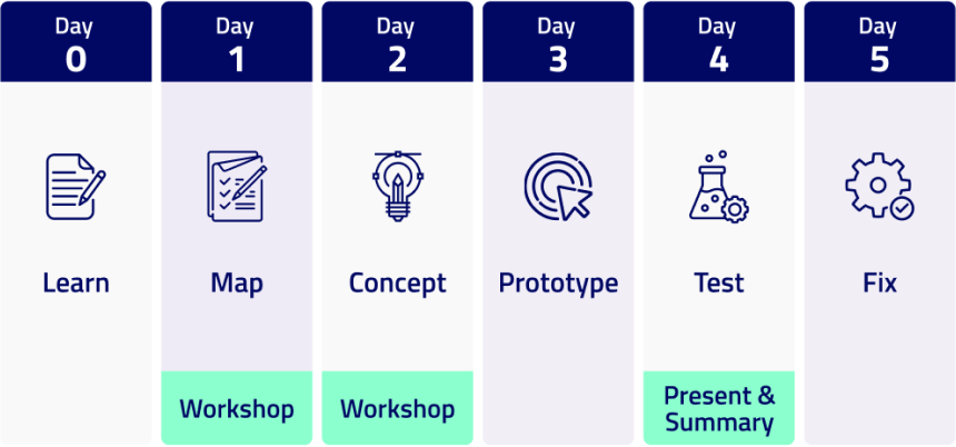
The Process
Discovery & Audit
We start by getting to know your product and vision through a structured UI brief and goal alignment. We review your current components, identify duplication, inconsistencies, and gaps.
Design Principles Definition
We establish typography, colours, hierarchies, and accessibility standards - the DNA of your system.
Building the Smart Library
We create a living system in Figma - complete with variants, interactions, and dev-ready connections.
Implementation
We work with your developers, run short enablement sessions, and ensure a smooth rollout.
Continuous Improvement
Adding new components, updating versions, and refining as your product evolves.
Success Story
How we built a new style guide in days — without touching the code. When cybersecurity company SAGE approached us, they needed a rapid facelift for an existing product plagued by usability and visual inconsistency. We faced a big constraint: a legacy style guide without variables — no global colour or font updates possible. Our team found a clever shortcut through Figma’s “Styles & Variables Organizer” plugin, scanning all screens and replacing colours and fonts instantly while flagging off-style elements. Within days, we delivered a fully refreshed, production-ready visual system — clean, cohesive, and implementation-ready — with zero friction between design, code, and deployment.
Microsoft
MSD
Playtika
Nice
Medtronic
NCR
Sign up
and start your journey
Contact Us
and start your journey
We use cookies
We use cookies
We use cookies and similar technologies to run this website and help us understand how you use it. Visit our Privacy Policy page for more information.


